Nicole And India Media
Friday 29 August 2014
Q1 Evaluation- Nicole Burrows
1) How does the production use/challenge/develop forms and conventions?
I created this question through a director’s commentary talking about specific parts of my music video in relation to how it conforms, develops or challenges forms and conventions of a typical music video through the stages of Goodwin's Analysis. By using Final Cut Pro, I have been able to add my voice over onto screenshots and video captures from my music video, so that I can clearly present my answer to Question One.
Sunday 13 April 2014
Friday 4 April 2014
Creating Digi Pack
FRONT COVER
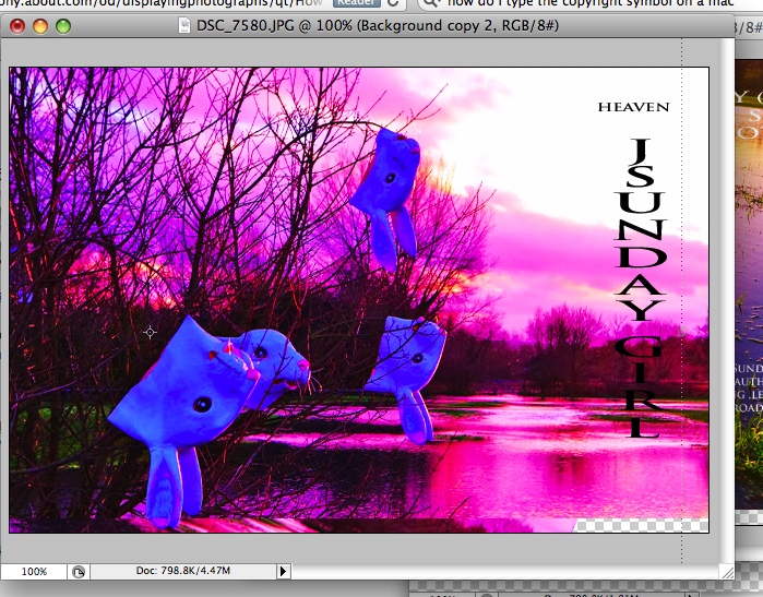
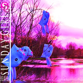
I started off with this image of the rabbit heads which are featured in my music video. i decided to hang the rabbit heads on trees to fit into my conceptual theme. I then edited the image on photoshop by increasing the saturation to make the images is slightly pinker which fits into the brand of sunday girl where the logo is also pink.
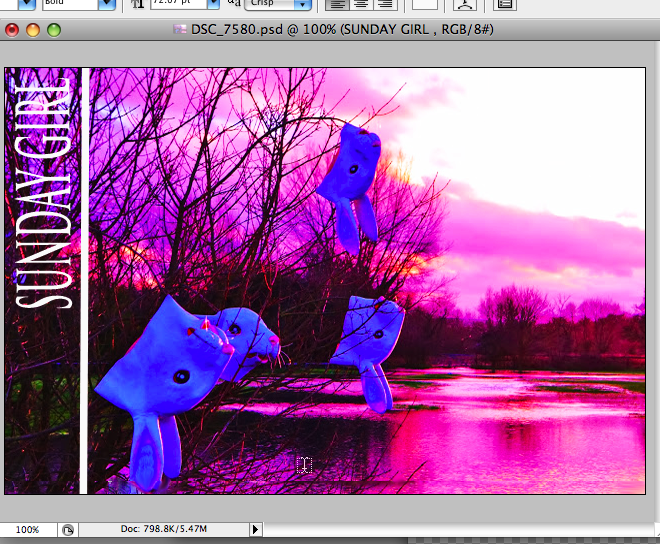
I then started playing around with titles.
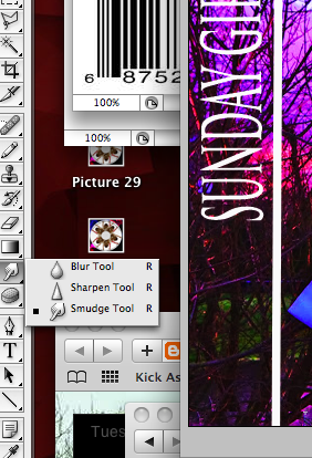
I then smudged the background of the image behind the title so that that the writing was clearer and stood out more.
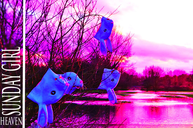
I then added the title Heaven which is the name of the song for the music video. I ensured that the artists name was larger as the target audience will identify her by her name more easily than by associaing her with the new song 'Heaven'.
BACK COVER
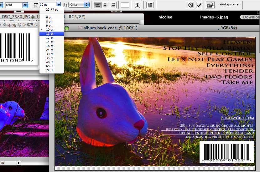
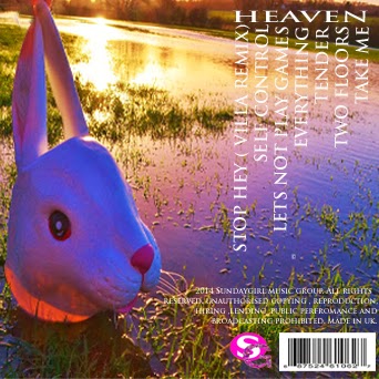
For the back cover I wanted ot ensure that it linked to the front because, through my research I found that this was coherent throughout all aritsts digi pack, therefore I applied it to my own. I edited the colours to make it look like sunset and exagerate the colour of the sun reflecting on the grass.
I then added fonts, ensuring that it was the same throghout the entire digi pack. I also added a barcode and details regarding the copyrights and the artsits and music groups rights over the music too.
I then made the writing smaller. I done this because the copyrights and information and the music group, and the company becasue they do not necesarily promote the artist. Additonally, a genral consumer will not read the writing in small, however, they have to legally have this information on there, so I made it a small as possible, ensuring that it is still ledgible.
I then edited the layout of the list of songs by laying them out in the same style as the front cover. I had the main song I wanted to promtoe on the album HEAVEN sitting horozontally at the top right of the image. And then I placed the other song titles vertically undernath the word HEAVEN. I done this through inspiration to other album covers I had seen. I also added my Sunday Girl loogo in at the bottom.
INSIDE COVER
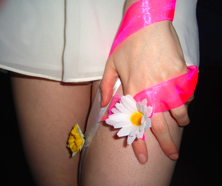
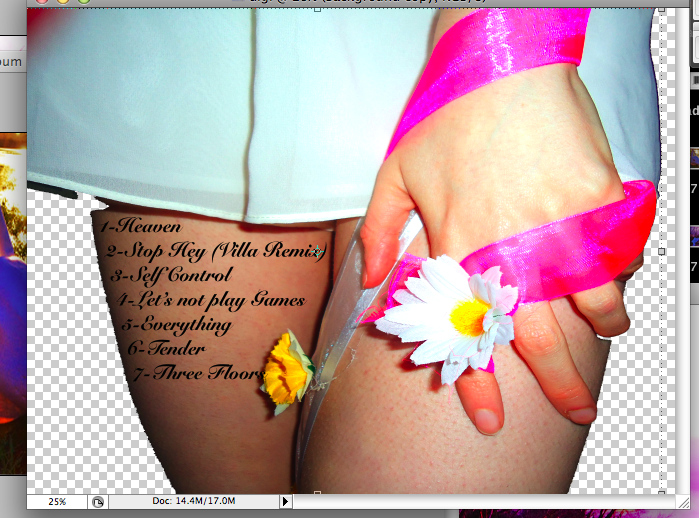
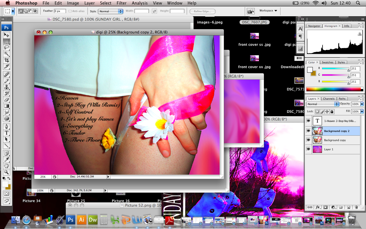
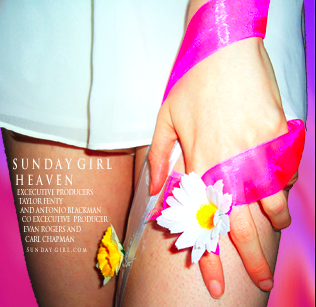
For the inside images I wanted to make it look slightly differnet, but still ensuring I still visually incorporate the theme into my digi pack through the same font, colours and background shots. Therefore i made the inside more about the artist, as the target audicne of young girls will want to see an image of thr artist so that they can build a rleatonship with her. This is done throught the artisits overall image E.g - her white outfit and fashion sense, her relation with nature and therefore the indie culture, as well as her appaearence which the target audicne will be inspired by to. I also wrote the thankyou statments on the leg of the artist Sunday Girl. For example notifying who the excecutive producers were and co excecutive producers.
I then cropped this image of the field featured in my front cover shot and blurred it using the blurred tool on photoshop.
I then cropped this image of the field featured in my front cover shot and blurred it using the blurred tool on photoshop.
This is my final design for the inside cover.
CD COVER
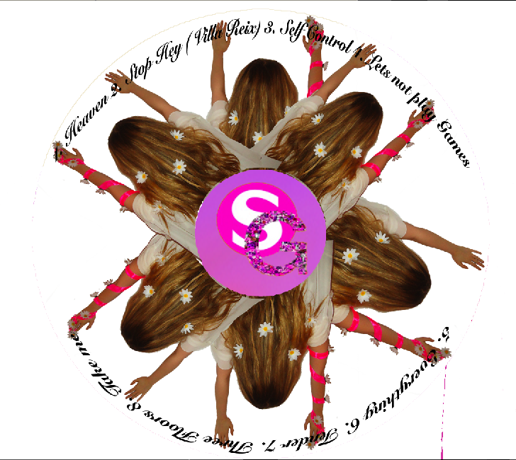
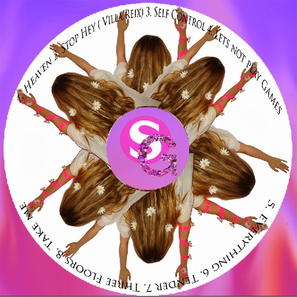
For the Cd cover I wanted an image of the artist however, as the front over is about rabbit masks i wanted to incorporate masks within it. Therefore within the entire digi pack you see parts of her but never her face almost like it is being hidden by a mask. I then replicated the image on photoshop and placed the SG logo in the middle. I then wrote the track names again around the circumference of the CD cover.
I then added my blurred design of the field (similarly to my inside cover ) to my cd cover too, so that my theme was consistent. To ensure this I then altered the font so that it was the same as all the other parts of the didi pack too.
Creating the Digi Pack and Website Logo
To create the Digi Pack I started off by thinking of the Sunday girl and how I can sell her to her target audience. Therefore, I thought about how I could sell her as a brand. I created a logo of Sunday Girl as an artist which I then placed onto each digi pack cover.
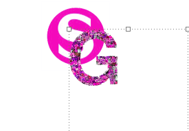
I started off by creating an S shape in a circle. the 'S' stands for 'Sunday' I then made the background pink, which I chose because her target audience are females and pink is a colour generally used in the media industry to convey femininity. I made the S white so that It stood out against the pink background.
I then used the magic wand tool on photoshop to eliminate the white background, This meant that when I eventually place this image onto a Digi pack cover the white will not be seen, which will ultimately look more professional.
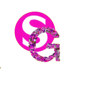
I then added in a G shape and edited the colour of it so that it was also pink, the background image is of a array of flowers I photographed edited into a collage in the G. I used flowers because it will allow this artist to express her femininity and indie music through nature. I then overlapped the S and the G to create SG which stands for the artists name- Sunday Girl.
This is the finished logo which I placed onto all of my Digi pack slides and website to create a brand Identity.
Thursday 3 April 2014
NICOLE OFFICIAL WEBSITE
http://nicoleindiaalmosta2.wix.com/sundaygirl
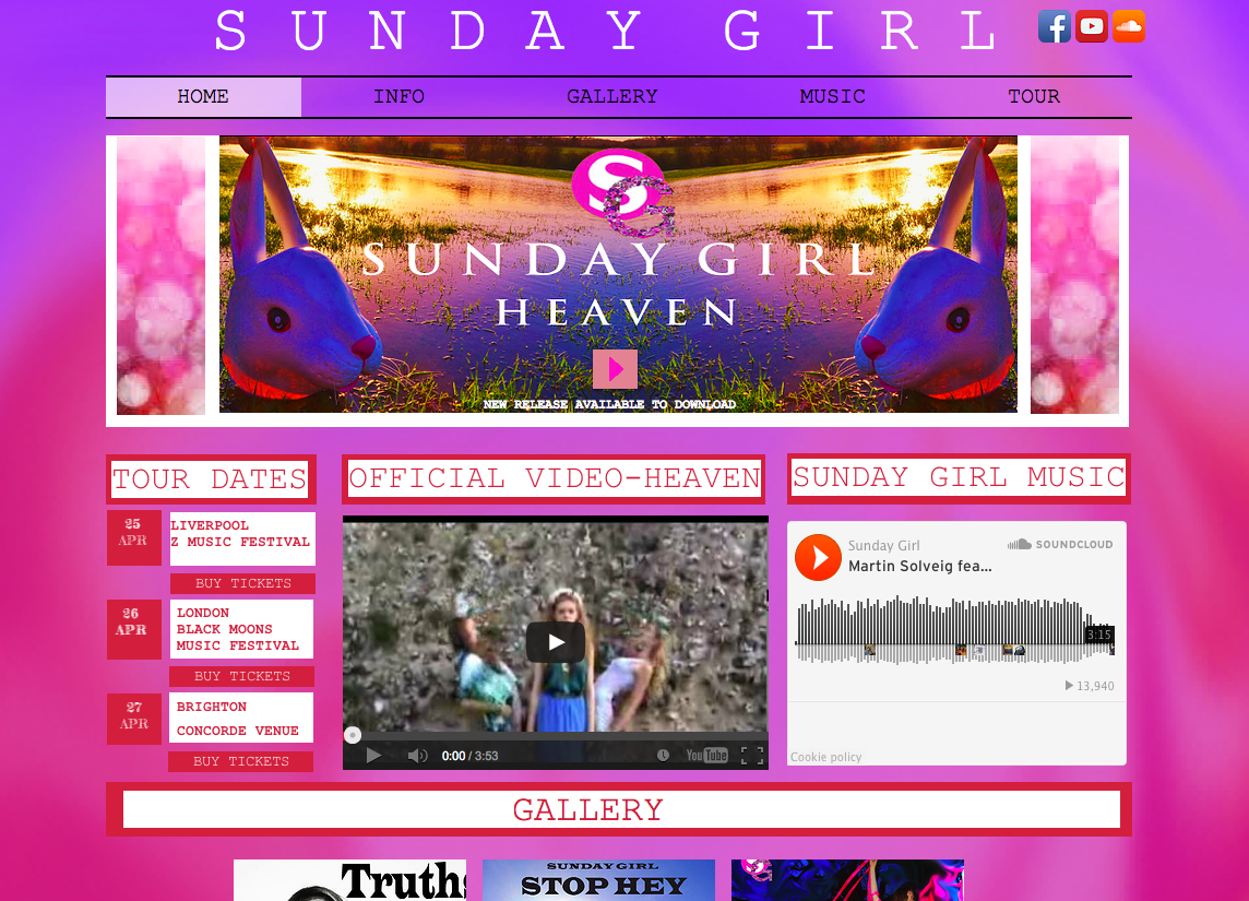
This is my website that I created on Wix.
I decided to incorporate the backgorund theme of the digi pack onto my website to show a link between the both. On the website I featured the new song 'Heaven' b placing it as the central focus at the top of the website.
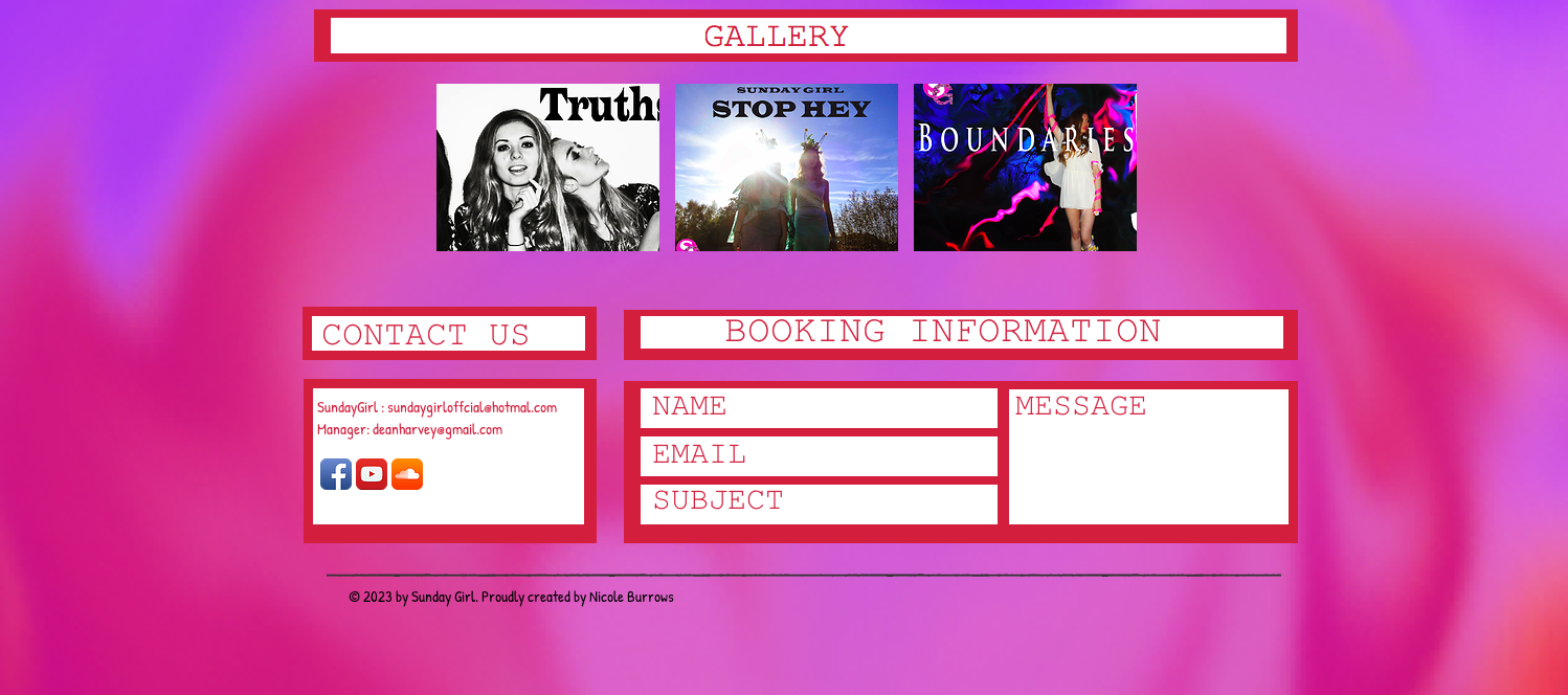
I then added a gallery, whcih features all Sunday Girls track with promotional images on them. I edited these photos using photoshop. On the website I have eidted thre gallery so that it is a slideshow that moves when the mouse is hovered over a speceified image in the gallery section. I then added in a contact section by adding in tabs that will directly take the user to either the Sunday Girl Facebook page, her youtube page or her soundlcoud page. This givest the viewer a variety of different medias in ehcih they can contact the managment team of the artist sunday girl.
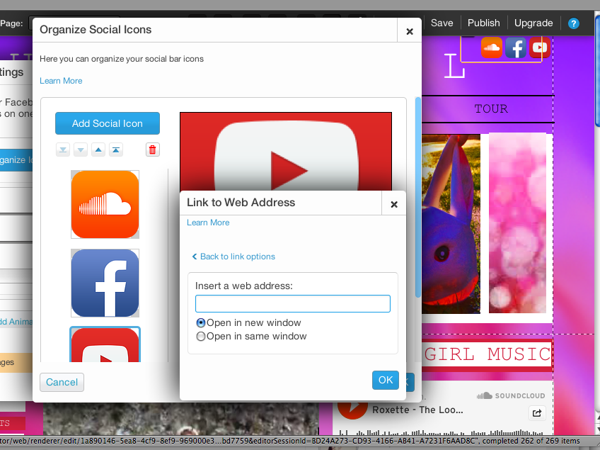
I then added social icons to the page. I done this by importing the web address into the wix website and then the icon would direct the user instantly to the speciified site.
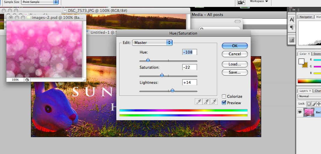
Here I was adjusting the image of the sunlight that I took. It was an interesting shot that had cirles within it so I exagerated it by increasing the hue and saturation. This created the pink effect. I then wanted to sharpen the image so I increased the contrast on the image and the brightness. I then made htis image part of the wesbite by putting it on the side of the banner.
This is my website that I created on Wix.
I decided to incorporate the backgorund theme of the digi pack onto my website to show a link between the both. On the website I featured the new song 'Heaven' b placing it as the central focus at the top of the website.
I then added social icons to the page. I done this by importing the web address into the wix website and then the icon would direct the user instantly to the speciified site.
Here I was adjusting the image of the sunlight that I took. It was an interesting shot that had cirles within it so I exagerated it by increasing the hue and saturation. This created the pink effect. I then wanted to sharpen the image so I increased the contrast on the image and the brightness. I then made htis image part of the wesbite by putting it on the side of the banner.
I then edited the album cover photo slightly and place it as the banner. I ensured the banner featured the SG logo whcih cretae brand indentity as the target audience will assoictae the symbol with the artist Sunday Girl. Additionally, I added a play button so that they can click onto it and listen to the song instantly.
Sunday 30 March 2014
Subscribe to:
Posts (Atom)
